XML Flash Slideshow v4 Help    |    Support Home    |    DWUser.com Home  Download Help PDF (29MB)    |    Search:

Understanding and Managing Layout Views

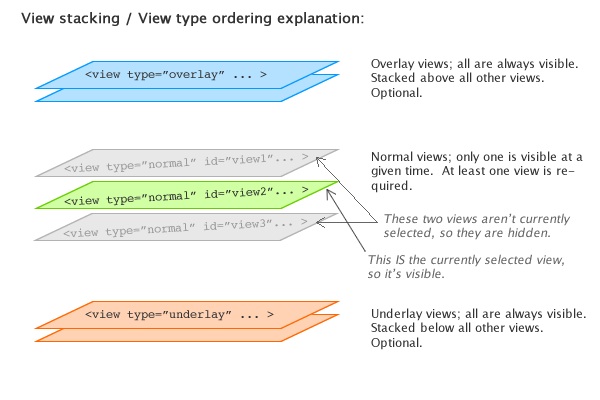
Slideshow layouts are made up of one or more "screens" which are referred to as views.    There are three different view types:

  • Overlay Views - Optional; any number can be used.    Overlay views are always visible.  They are outside of the normal changeable views, resting at the very top of the visual stack, always overlaying all the other views.  They provide a way to float elements on top of all other layout elements.  For example, you will usually place the SingleLoader and GroupLoader elements (which display [pre]loading progress) in an overlay view, so that no matter what the current layout state is, the user will be notified of the loading status.
  • Normal Views - At least one is required.    These views are positioned between the Overlay and Underlay views, and only one is visible at a given time.  They generally hold the main content.    Because only one is visible at a given time (and you can configure the transition between each), these views allow you to create multiple "screens" within the slideshow, each with a different appearance and a unique set of constituent elements.    When transitioning, you can use simple cut effects or advanced visual effects like views 'popping' in and out, or a cube rotation.  See Using the 'Global Configuration and Playback Settings' Section for more information about transitions.
  • Underlay Views - Optional; any number can be used.    Underlay views are always visible.  They are outside of the normal changeable views, resting at the very bottom of the visual stack, always below all the other views.  You can have one or more underlay views.   They provide a way to display constant background elements which should always be visible, regardless of which normal view is currently visible.

The following diagram provides a visual representation of how views function:

Managing Views in the Wizard

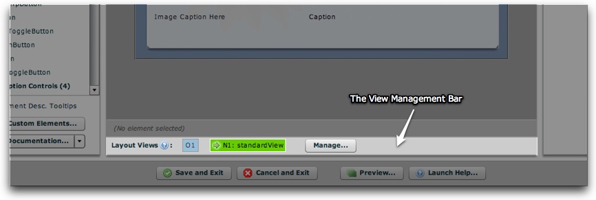
Within the Layout / Presentation section is the View Management Bar, located just below the Design Area:

Here is a diagram explaining the various parts of the management bar:

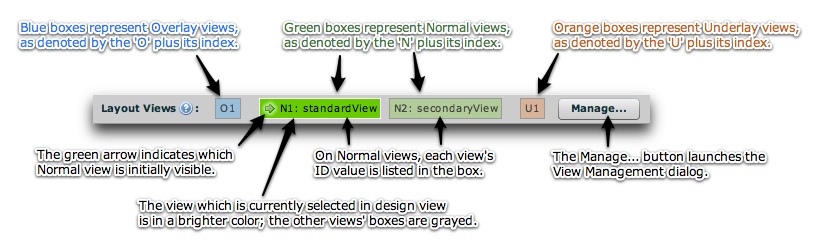
As noted in the photo, here is some information about the various aspects of the bar:

  • There are several boxes displayed in the bar, one to represent each layout view which has been defined.
  • Blue boxes represent Overlay views.  The boxes for these views are labeled O1, O2, etc ('O' for Overlay).
  • Green boxes represent Normal views.    The boxes for these views are labeled N1, N2, etc ('N' for Normal), followed by the view's ID value.
  • Orange boxes represent Underlay views.    The boxes for these views are labeled U1, U2, etc ('U' for Underlay).
  • On one of the Normal views, a green arrow will be shown.  The arrow indicates that view is the initially displayed view.    
  • The 'Manage...' button on the right launches the View Management dialog where you can create, modify, and remove views.

To select a view for editing, click on its box once.    Only one view is visible at a given time in design view to prevent confusion.    The selected view is a brighter color in the bar; all other unselected views are grayed.    To make changes.

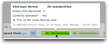
Hovering over one of the view boxes will display more information about that view.    Here is an example tooltip for a Normal view:

And an example tooltip for an Underlay view:

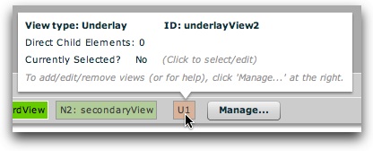
Information in these tooltips includes:

  • The view type
  • The view's ID value
  • The number of direct child elements in the view
  • Whether the view is the currently selected view (for editing in the wizard).    When a view is selected, it will be visible above in the Design Area.
  • If the view is a Normal view, whether it is the initially displayed view.

Tip:  If you have defined more than one Normal view, you can change which one is opened initially directly from the View Management Bar (without launching the View Management dialog).    To do so, right-click on the view you want to be initial and select 'Make this the initial view':

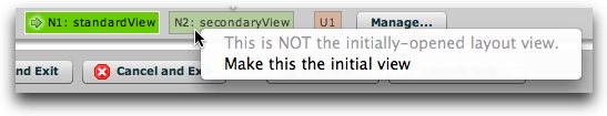
Tip - Understanding the 'Initially-Opened Layout View' setting: Only one Normal view is visible at a given time in the slideshow.    When you create more than one Normal view, therefore, you must specify which one of these will be initially visible.

The View Management Dialog

Click the 'Manage...' button to launch the View Management Dialog.    This is where you'll create, modify, and remove views.    The dialog appears as follows:


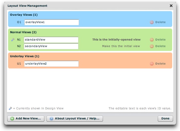
A visual representation item is shown for each view, grouped by view type.    The editable text box represents the view's ID value (only required for Normal views).    This ID value is used to identify the view when changing between Normal views.    Therefore, you should enter a meaningful name for each Normal view, and not modify it if you have referenced it elsewhere (e.g. in a LayoutJumpButton element).    

The small wrench icon indicates which view is currently selected for editing in Design View.    For normal views, you can change which is initially displayed by clicking the 'Make this the initial view' button next to the view you want initially displayed.

To add a new view, click the 'Add New View...' button:

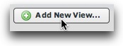
The following prompt will open:

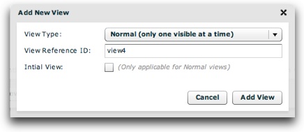
You'll enter the view type (Normal, Overlay, or Underlay), reference ID, and -- if the view type is Normal -- whether the view is initially displayed.  Then, click the Add View button to add the view.

To remove an existing view, click the Delete button on the right:

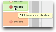
If any child elements have been added to that view, you will be asked to confirm the deletion.

For Advanced Users: Alternate Methods of Specifying the Initially Displayed View

Note: This sub-section is only for advanced users and developers; beginners can skip over it.

You can specify the initial view by three different means, with each method overriding the methods listed before it.

  1. 1.  (The default method)    By specifying the <view ... initial="true"> attribute value.  This is set visually in the wizard through the Manage Views window detailed above.  
  2. 2.   By specifying a javascript callback in the slideshow's HTML page which defines the initial view id. For more information about this method, see the XMLFlashSlideshow_v4_getInitialViewID item in the SlideshowInterface class description. If specified, this value overrides the initial view ID specified by method one.  (For more information, see the com.dwuser.ss4.core.SlideshowInterface class within the API Reference.)
  3. 3.  By specifying the initViewID parameter on the slideshow configuration object.   This value is either passed in the slideshow's HTML configuration object (in a standalone implementation), or through the slideshow's configurationParameters object in the case of a component implementation.  See the FlashSlideshow.configurationParameters property and the FlashSlideshow class description for more information.  If specified, this value overrides the initial view ID specified by methods one and two.    (For more information, see the com.dwuser.ss4.ui.FlashSlideshow class within the API Reference.)


Changing Between Views + View Transition Effects

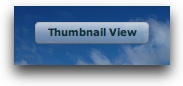
At runtime (when your slideshow has been deployed), you can provide buttons to allow the user to switch between different Normal views (if you have defined more than one Normal view).    This is done with the LayoutJumpButton element (in the Slideshow Control Buttons folder).    This is a simple button which, when clicked, changes the current layout view.    You will use the Properties Panel to specify the label for the button, as well as the view which will open when it is clicked.    Here is an example of a layout jump button in action:

When the user transitions between views, a transition effect can be optionally played.    These effects can be simple fades or complex ones such as a rotating cube.    This is controlled in the wizard by using the Layout Transition Settings pod within the Global Configuration and Playback Settings section.  See Using the 'Global Configuration and Playback Settings' Section for more information.

Note for Advanced Users & Developers: For more information about controlling the layout transition programmatically, see the LayoutManager class reference mentioned below in the 'Corresponding XML Structure' section.

Special View Parameters / Options

There are a number of special parameters which can specified for each view.    These parameters must be passed through the XML, by adding attributes on the appropriate view node.  To learn more about these options, see the com.dwuser.ss4.ui.LayoutManager class reference within the API Reference.    Here is a brief overview of the various options which can be controlled:

  • Stop Autoplay - A view can automatically stop/pause autoplay as soon as it is opened.    This is often used to pause a slideshow while a user selects a different gallery.
  • Start Autoplay - A view can automatically start/enable autoplay as soon as it is opened.    This is often used to resume a paused slideshow once the user has selected a different gallery.
  • Stop Audio - A view can be configured to automatically stop any audio playing on one or more levels (intro, gallery, and image).    This is often used to pause audio while a user selects a different gallery.
  • Start Audio - A view can be configured to automatically play any audio specified for one or more levels (intro, gallery, and image).    This is often used to play audio once a user has selected a different gallery.
  • Treat as Bitmap - Allows any non-embedded text within that view to be faded.    Generally, for performance reasons, it is much better to add treatAsBitmap directly to individual elements, and not apply it to an entire view.

To learn more about the implementation of one of these specific options, see the reference mentioned above.    Note that these modifications require familiarity editing XML, and are only recommended for advanced users and developers.

Corresponding XML Struture

For information about the XML structure behind layout views (and the user interface in general), see The <ui> section - User Interface within the Developer Reference.    Also be sure to see the com.dwuser.ss4.ui.LayoutManager class reference within the API Reference.