 Download Help PDF (29MB) | Search:
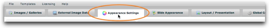
The main Appearance Settings section is accessed by selecting the tab at the top of the wizard window:
The Appearance Settings section is where you will configure many settings which control the appearance of the overall slideshow. The section appears as follows:
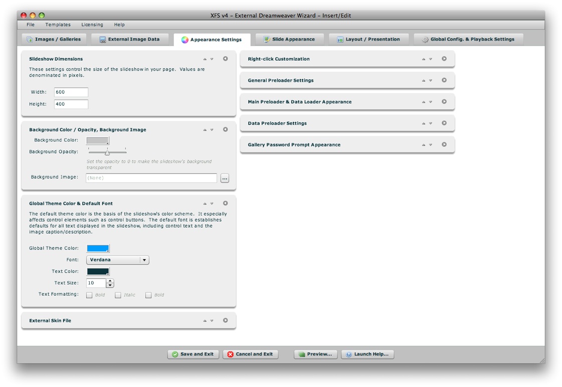
The Appearance Settings panel is made up of a number of collapsible pods. You can expand the pods which are most relevant to you, and re-order them as desired. The order and expanded/collapsed state of the pods is automatically saved, and the last view is restored each time you re-launch the wizard. This is designed to streamline the development process, instantly placing the most relevant and commonly used settings at your fingertips.
Each pod has several control buttons at the top right:
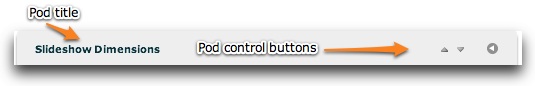
The first button allows you to move the pod up one space:
The second button allows you to move the pod down one space:
The third and final button allows you to expand or collapse the pod:

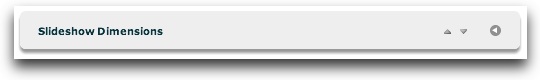
Tip: You can also expand or collapse a pod by clicking on its title.
When collapsed, a pod will appear like this:
The following sections of this topic detail each pod and the options each controls.
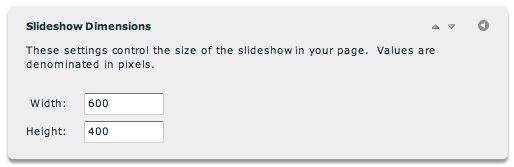
This is where you will specify the dimensions of the slideshow. This is the overall size of the slideshow element in your page. Both values are denominated in pixels. You can also use a percentage value (usually 100%), when creating a full-browser-window slideshow for example.
You can also modify the slideshow dimensions in the Property Inspector after you have inserted a slideshow.
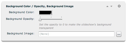
This pod contains the background appearance options for the slideshow. Option overview:
| Property | Description |
|---|---|
| Background Color | The color of the background behind the slideshow. Only applicable if Background Opacity is greater than 0. |
| Background Opacity | Specifies the opacity (and transparency) of the background color. If you set the value to 0% opacity / 100% transparency, then the slideshow will be transparent. In this case, any content in the HTML page behind the slideshow will show through. |
| Background Image | Optionally specifies the image which should show as part of the slideshow background. Use the browse button on the right ('...') to select a JPEG, PNG, SWF, or GIF file. The URL must be relative to the HTML page holding the slideshow; using the browse button will automatically create this URL properly. A background image can be used much like a loading image, if you want a specific image to be visible while loading occurs. |
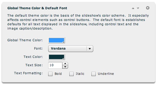
The default theme color is the basis of the slideshow's color scheme. It especially affects control elements, such as control buttons' icon color. The default font establishes defaults for all text displayed in the slideshow, any control text and the image description/caption. The text size is denominated in pixels. The theme color and font settings can be overridden on any specific layout element using the Properties panel.
Note: See the API Reference for each referenced class for more information.
| Property | XML Destination |
|---|---|
| Global Theme Color | Application.@themeColor |
| Font | Application.@fontName |
| Text Color | Application.@color |
| Text Size | Application.@fontSize |
| Text Bold | Application.@fontWeight |
| Text Italic | Application.@fontStyle |
| Text Underline | Application.@textDecoration |
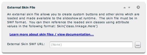
This pod allows you to specify a custom SWF skin file which contains skin assets for the slideshow. These skin files can be used, for example, to customize buttons and other skinnable assets. Icons can be embedded as well. All embedded skin and icon assets which have an export linkage class will then be accessible in the slideshow by using the following format in a Skin or Icon field:
Skin('class.linkage.Here')
Where class.linkage.Here is the class name you used when setting the linkage settings for the clip.
To learn more about creating custom skins, see the Custom Skin Files / Custom Buttons topic.
The URL must be relative to your local file, and should be hosted on the same server (accessible by a relative URL) to ensure that you don't experience Flash Player cross-domain loading restrictions.
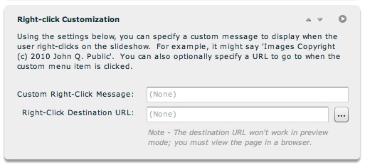
By default, right-clicking on the slideshow only shows 'Settings...' (disabled) and 'About Adobe Flash Player...'. If you prefer, you can customize this menu by adding a custom right click message in the 'Custom Right-Click Message' field. This should be a short string value, such as 'Images Copyright (c) 2010 John Q. Public'. If you specify only a message value, the message will appear disabled in the context menu. If you specify a 'Right-Click Destination URL' as well (e.g. http://www.mysite.com/somepage.html), the message will be enabled and clicking on it will redirect to that URL. Use the browse button on the right ('...') to select a file directly.
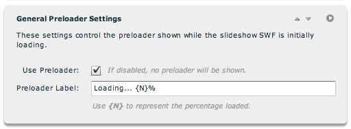
The settings in this pod control the preloader which is displayed while the slideshow SWF is initially loading.
| Property | Description |
|---|---|
| Use Preloader | Specifies if a preloader should be shown at all. If disabled, no preloader will be shown. You can disable the default preloader and specify a background image if you want a custom preloader. |
| Preloader Label | If the preloader has been enabled, this controls the label on the preloader. Wherever {N} is included in the label, it will be replaced with the currently loaded percentage. For example, the default label value would show 'Loading... 50%' halfway through loading. |
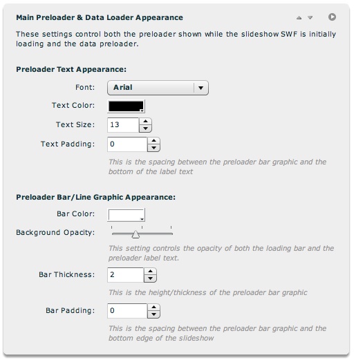
The settings in this pod control the appearance of all preloaders -- both the one shown while the slideshow SWF is initially loading and the data preloader.
| Property | Description |
|---|---|
| Font / Text Color / Text Size | These settings control the appearance of the preloader text. Text size is denominated in pixels. |
| Text Padding | Specifies the spacing (in pixels) between the preloader bar graphic and the bottom of the label text. |
| Bar Color | The color of the preloader bar which grows in size. |
| Bar Opacity | The opacity (and transparency) of both the preloader bar and the preloader label text. A lower value makes the preloader less obtrusive, but also less noticeable. |
| Bar Thickness | Specifies the height/thickness of the preloader bar in pixels |
| Bar Padding | Specifies the spacing, in pixels, between the preloader bar graphic and the bottom edge of the slideshow. The default value (0) positions the bar directly agains the bottom of the slideshow. |
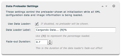
The settings in this pod control the preloader shown at initialization while all XML configuration data and image information (any external image data) is being loaded.
| Property | Description |
|---|---|
| Use Data Loader | Specifies if a data preloader should be shown at all. If disabled, no data preloader will be shown. You can disable the default data preloader and specify a background image if you want a custom data preloader. |
| Data Loader Label | If the data preloader has been enabled, this controls the label on the data preloader. Wherever {N} is included in the label, it will be replaced with the currently loaded percentage. For example, the default label value would show 'Loading Data... 50%' halfway through loading. |
| Fade-out Duration | When data loading completes, the data preloader quickly fades out prior to the slideshow initializing. You can customize the length of this fade-out effect, or essentially disable it by setting it to 0 or 0.1. The value is denominated in seconds. |
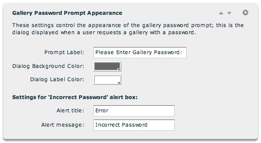
The settings in this pod control the appearance of the gallery password prompt. This is the dialog displayed when a user request a gallery which has been password-protected.
| Property | Description |
|---|---|
| Prompt Label | This is the label displayed in the password prompt dialog, which asks for the user to enter the gallery password. Generally, you would only want to modify the value if you need to translate it to another language. |
| Dialog Background Color | Specifies the background color of the password prompt dialog. |
| Dialog Label Color | Specifies the color of the text in the password prompt dialog. |
| Alert Title | Specifies the title of the alert box displayed if a user incorrectly enters the gallery password. Generally, you would only want to modify this value if you need to translate it to another language. |
| Alert Message | Specifies the message in the alert box displayed if a user incorrectly enters the gallery password. Generally, you would only want to modify this value if you need to translate it to another language. |
Note: See the API Reference for each referenced class for more information.
| Property | XML Destination |
|---|---|
| Prompt Label | GalleryPasswordPanel.@promptLabel |
| Dialog Background Color | GalleryPasswordPanel.@backgroundColor |
| Dialog Label Color | GalleryPasswordLabel.@color |
| Alert Title | GalleryPasswordAlert.@baseTitle |
| Alert Message | GalleryPasswordAlert.@baseLabel |
Most of the settings in this section are initialization settings, passed through the slideshow HTML. For detailed reference on all initialization parameters, see the com.dwuser.ss4.core.FlashSlideshowConfigurationParameters class in the API Reference.