Cooking with Typography: 4 Fundamentals
by Keith Bryant
Content is king – we’ve heard it said almost a thousand times now. But content without good design won't ever garner the respect it deserves. Typography helps give content its voice. Because of this, it is one of many facets of design that we as web professionals should take the time to master.
Typography is the art and study of arranging letterforms and words. It’s not just about ensuring the readability and scannability of text on various mediums. It’s also about enhancing context and meaning, breathing life into language and giving information a soul.
Good typography requires a great deal of creative intuition, but to master typography, you also need to learn its fundamental rules. Creative mavericks, like us, often go rogue in the name of beauty, but how can we break the rules if we do not know them in the first place?
If you find yourself so intimidated by the idea of typography that you prefer to stick to using a couple of reliable (but rather generic) typefaces in ALL of your designs, you’re not alone. However, don’t just settle for bland and refuse to grow.
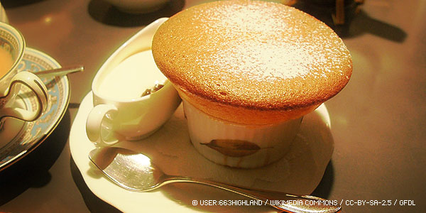
Think of good web typography as a soufflé. The soufflé doesn't come from thin air; the soufflé starts with a recipe. Good web typography is a recipe of four essential ingredients. Just follow the recipe and everything’s going to be alright.
Let’s start cooking.
1. The Principles of Typography: Contrast
In the tea-room the fear of repetition is a constant presence. The various objects for the decoration of a room should be so selected that no color or design shall be repeated. If you have a living flower, a painting of flowers is not allowable. If you are using a round kettle, the water pitcher should be angular. A cup with a black glaze should not be associated with a tea-caddy of black lacquer. In placing a vase of an incense burner on the tokonoma, care should be taken not to put it in the exact centre, lest it divide the space into equal halves. The pillar of the tokonoma should be of a different kind of wood from the other pillars, in order to break any suggestion of monotony in the room. (Okakura Kakuzo, author of The Book of Tea)
Repetition is boring; contrast breaks monotony and creates drama. Contrast, when used in harmony with white space, can be used to create a visual hierarchy among text elements. By using different font sizes, styles, weights, colors and even typefaces, you can make each element distinct and create meaningful contrast. Be careful though – there is a thin line between contrast and clash. Aim for drama, not clutter. Here are a few rules of thumb to live by:
- When pairing up typefaces, try using a sans serif with a serif. This goes a long way.
- Make the text contrast with its background to make it comfortably readable. Here’s a tip: take a screenshot of your webpage, load it into your favorite image editor and desaturate it. This will help you determine if you have enough contrast to work with.
- Instead of using two or more typefaces, try using one that comes with various styles and weights.
2. The Principles of Typography: Space
The typographer’s art concerns not only the positive grain of letterforms, but the negative gaps between and around them. (Ellen Lupton, author of Thinking With Type)
According to French philosopher Jacques Derrida, the alphabet, whose purpose is to represent sound, cannot serve its function without silent marks and spaces, as demonstrated by the image below.
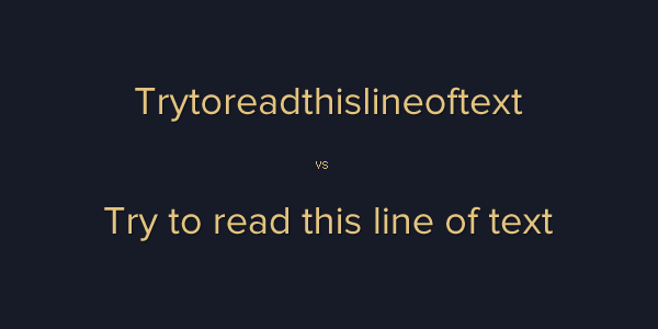
Space maintains the flow of design, and it gives strength to structure. Space lets your text breathe. It reduces strain on the reader’s eyes by keeping them focused and steady – preventing them from aimlessly wandering toward neighboring elements. In other words, space reduces distraction.
It’s important, however, to maintain a balance between the positive and negative elements of a web page; that is, to use the right amount of space. Too much or too little space will strand your reader amidst a torrent of pixels. To determine the appropriate amount of space a design needs, many designers use the golden ratio. Others prefer to use grids that apply similar principles.
There are many ways to create space in a design.
Tracking and Kerning
Tracking: The space between any two letters
Kerning: The space between specific combinations of two letters, often involving overhangs (such as “AW”)
Tracking does not just refer to letter space. It refers to the global adjustment of space between letters and within words, lines and paragraphs. There’s an intertwined relationship between letter and word such that changing the spaces between letters requires a similar adjustment in the spaces between words; this relationship is called kerning. There is also a relationship between the width of a letter to the amount of space required for the human eye to start distinguishing the end of a word and the start of another; the wider the letters, the bigger space the eye needs.
As text gets bigger, the space between the letters also expands. This is why many designers adjust the tracking to avoid getting too much space between the letters of headlines and logos.
Leading
Leading, also known as line height, refers to the space between lines. In web design, a good rule of thumb is to make sure that the line height is at least 140% of the font size, but there are other factors you need to consider when calculating the right leading value for a block of text.
First, there’s measure. Measure refers to line length or the width of a column of text. The wider the measure, the greater the leading required to preserve readability. The same is true for the opposite. Narrow columns of text with large line height values look fragmented and can be very difficult to read.
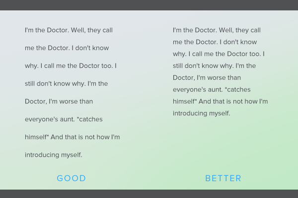
Second, you need to consider letterforms. The more the letterforms deviate from conventional typefaces, the greater the leading required. Design and script typefaces, for example, require a bigger leading. Typefaces that have strong vertical strokes, such as Bodoni and Palatino Linotype, also require a bit more leading to compensate for their weak horizontal strokes.
Margins and gutters
Margins and gutters (horizontal space between columns) help frame text blocks in a web page. Adding suitable margins around a block of text improves its cohesiveness, especially when set against other visual elements of a page. Gutters and horizontal breaks make a web page seem more organized, if not tidier. The less space there is around blocks of text, the busier and more distracting the entire page seems.
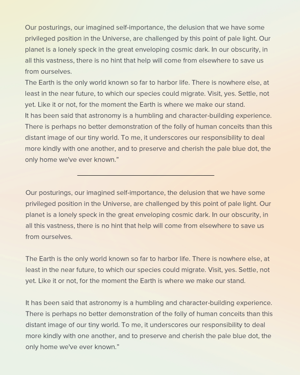
Always keep margins and gutters proportional to the tracking, kerning and leading in a design. If paragraph breaks are roughly the same size as the line height, the paragraphs will look like one giant wall of text. No one enjoys reading walls of text. Visible paragraph breaks will actually make the reader want to read more. Each space will not only allow the eye to rest for a few seconds, it will also give the reader a chance to mentally digest the last paragraph.
3. The Principles of Typography: Hierarchy
Hierarchy represents how each text element is related to others on a webpage, in terms of meaning and value.
It’s a common practice to use scaling to demonstrate hierarchy and importance. For example, many websites use larger font sizes for headings than for body text. In much the same way, H1 headings are shown larger than H2 headings, and so on. As a general rule, make sure that your H1 headings are larger than the rest. Use it for the title of the website or an article on your website. The larger the perceived meaning and encompassing value of a piece of text, the more it deserves being tagged H1. This is also why it’s a good idea to tag your brand logo with H1.
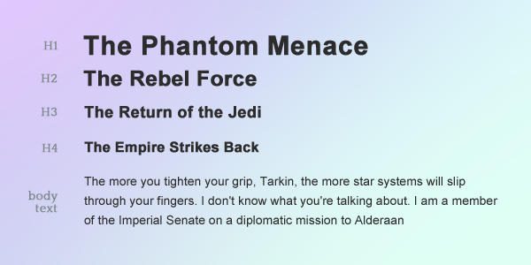
Applying the principles of contrast is one way to establish hierarchy between two text elements. Use either color, style or direction to achieve this. You may even use different but complementary typefaces.
According to the Gestalt theory of human perception, things seem to belong together if they are placed closer to each other (law of proximity). Knowing this, you can illustrate hierarchy among text elements simply by manipulating the white space around them. As a rule of thumb, keep unrelated elements away from each other and vice versa.
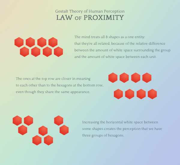
4. The Principles of Typography: Size
Size is probably the most fundamental principle of typography. It can be used to create dramatic contrast, demonstrate hierarchy as well as set the stage for readable content.
When determining the right font size for your body copy, consider your target audience. For instance, small font sizes aren’t suitable for the elderly or children. Consider, too, the medium on which your target audience reads the content. Do they often use mobile devices to browse your website? Do they prefer to use laptops? In this case, it’s also a very good idea to consider how much visual real estate you have. The size of your text should always be relative to the size of the browser viewport.
Size is also a tool for demonstrating hierarchy on a web page by creating contrast between text elements. For example, subheadings are usually shown to be larger than the paragraphs they summarize or introduce (see the image below).
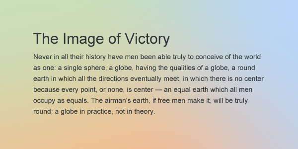
As a rule of thumb, do not set text below 10 or 12 pixels. If screen size permits, make it even bigger. Applying this in web typography is easier with the use of media queries. Just set the base font size for your page depending on the size of the viewport and use EM units to set the font size for individual text elements.
The Soufflé is the Recipe
Over the ages, typography's central role in design has been proven, and it still works, both in print and digital design. Remember that the four fundamental principles of typography (contrast, space, hierarchy and size) are not rules or laws, but rather guidelines for every designer to follow. Typography is quite intimidating, at first. Just apply the rules of thumb above and you can whip up your own typographical soufflé in no time!