DWUser.com
Empowering Web Creativity
Support Center - EasyRotator for WordPress
EasyRotator KnowledgeBase – Making Layout Customizations
Basic customization options for each layout template can be set when the template is applied in the Layout / Presentation section. If you're familiar with basic HTML and CSS editing, you can also make more advanced adjustments to a rotator by editing its layout source code.
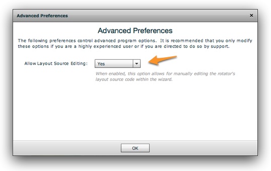
To access this code for editing, select File > Advanced Preferences (in the top-left corner of the editor window) and enable layout source editing:
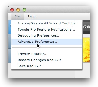
Tip: Don't see the Advanced Preferences item? Make sure you've installed the latest version of the EasyRotator editor application.
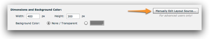
You'll then be able to edit the layout source code in the Layout / Presentation section of the wizard, via the Manually Edit Layout Source button:
As long as you're familiar with basic HTML and CSS, all of the options such as colors and fonts are self-evident.
Specifying Custom Arrow Button Images
To replace the default arrow images with custom ones, locate the lines that look similar to this in the layout code:
<div class="erimgMain_arrowLeft" style="position:absolute; left: 10px; top: 50%; margin-top: -15px;" data-erConfig="{image:'circleSmall', image2:'circleSmall'}"></div>
<div class="erimgMain_arrowRight" style="position:absolute; right: 10px; top: 50%; margin-top: -15px;"></div>
The lines are identified by class="erimgMain_arrowLeft" (the left arrow) and class="erimgMain_arrowRight" (the right arrow). Note the highlighted data-erConfig property on the first div; this is what specifies the arrow images to be used. If either line doesn't have a data-erConfig value explicitly specified, you need to add one. Using our example from above, you would copy and paste the first line's data-erConfig value onto the second line:
<div class="erimgMain_arrowLeft" style="position:absolute; left: 10px; top: 50%; margin-top: -15px;" data-erConfig="{image:'circleSmall', image2:'circleSmall'}"></div>
<div class="erimgMain_arrowRight" style="position:absolute; right: 10px; top: 50%; margin-top: -15px;" data-erConfig="{image:'circleSmall', image2:'circleSmall'}"></div>
In each data-erConfig attribute, the up-state button image is specified via the image property, and the hover-state button image is specified via the image2 property. For example, if we wanted to use images/button-left-up.png and images/button-left-hover.png, the following code would be needed:
data-erConfig="{image:'images/button-left-up.png', image2:'images/button-left-hover.png'}"
Each value should be the URL to that arrow image file. If you're using WordPress, you'll need to first upload your images to the media library and copy their full http://-based URLs. Using our example again, here's what the final updated code might look like:
<div class="erimgMain_arrowLeft" style="position:absolute; left: 10px; top: 50%; margin-top: -15px;" data-erConfig="{image:'images/button-left-up.png', image2:'images/button-left-hover.png'}"></div>
<div class="erimgMain_arrowRight" style="position:absolute; right: 10px; top: 50%; margin-top: -15px;" data-erConfig="{image:'images/button-right-up.png', image2:'images/button-right-hover.png'}"></div>
Changing the Fade Speed in Pro Templates
To increase or decrease the speed of the fade transition in Pro templates, locate the line that looks similiar to the following (it will be near the top of the layout code):
<div class="erimgMainOneUp" style="position: absolute; left: 0; right: 0; top:0; bottom:0;" data-erConfig="{scaleMode:'fillArea', transition:'fade', imgType:'main', loopNextButton:true, __alwaysPreviousButton:true, arrowButtonMode:'always'}">
The line is identified by class="erimgMainOneUp". Note also the highlighted data-erConfig property at the end of the line; this is where you will be making a code modification. To set the custom fade speed, add a new duration property with a numeric value at the end of the data-erConfig attribute, like this:
data-erConfig="{scaleMode:'fillArea', transition:'fade', imgType:'main', loopNextButton:true, __alwaysPreviousButton:true, arrowButtonMode:'always', duration:1000}"
The value is specified in milliseconds (1000 milliseconds = 1 second). You can specify any value of 1 or greater (if you want an instant transition, use 1 not 0). Using our example again, here's what the final updated code might look like:
<div class="erimgMainOneUp" style="position: absolute; left: 0; right: 0; top:0; bottom:0;" data-erConfig="{scaleMode:'fillArea', transition:'fade', imgType:'main', loopNextButton:true, __alwaysPreviousButton:true, arrowButtonMode:'always', duration:1000}">
Changing the Slide Transition Speed
To increase or decrease the speed of the slide transition in standard layout templates, locate the line that looks similiar to the following (it will be near the top of the layout code):
<div class="erimgMain" style="position: absolute; left: 0; right: 0; top:0; bottom:0;" data-erConfig="{scaleMode:'fillArea', imgType:'main', loopNextButton:true, __alwaysPreviousButton:true, arrowButtonMode:'always'}">
The line is identified by class="erimgMain". Note also the highlighted data-erConfig property at the end of the line; this is where you will be making a code modification. To set the custom transition speed, add a new duration property with a numeric value at the end of the data-erConfig attribute, like this:
data-erConfig="{scaleMode:'fillArea', imgType:'main', loopNextButton:true, __alwaysPreviousButton:true, arrowButtonMode:'always', duration:1000}"
The value is specified in milliseconds (1000 milliseconds = 1 second). You can specify any value of 1 or greater (if you want an instant transition, use 1 not 0). Using our example again, here's what the final updated code might look like:
<div class="erimgMain" style="position: absolute; left: 0; right: 0; top:0; bottom:0;" data-erConfig="{scaleMode:'fillArea', imgType:'main', loopNextButton:true, __alwaysPreviousButton:true, arrowButtonMode:'always', duration:1000}">
Adding a Play/Pause Button
To add a play/pause button to your layout that allows users to control autoplay, add the following code at the end of the existing layout code:
<div class="erplayPause" align="center" style="position:absolute; left:50%; margin-left: -33px; top:2px;">
    <a href="#">
        <img src="http://easyrotator.s3.amazonaws.com/1/i/rotator/btns/playpause/play20_14_black.png" border="0" width="20" height="20" class="erplayPause_btn_play" />
        <img src="http://easyrotator.s3.amazonaws.com/1/i/rotator/btns/playpause/pause20_14_black.png" border="0" width="20" height="20" class="erplayPause_btn_pause" />
    </a>
</div>
Update the highlighted positioning values as desired to control where the button appears in the layout.
When adding a play/pause button to your layout, you will likely want to disable the Pause Autoplay on Hover option in the Settings section of the editor.
We're Here to Help!
If you have any questions about this article or about using EasyRotator for WordPress, please let us know by opening a support ticket below.